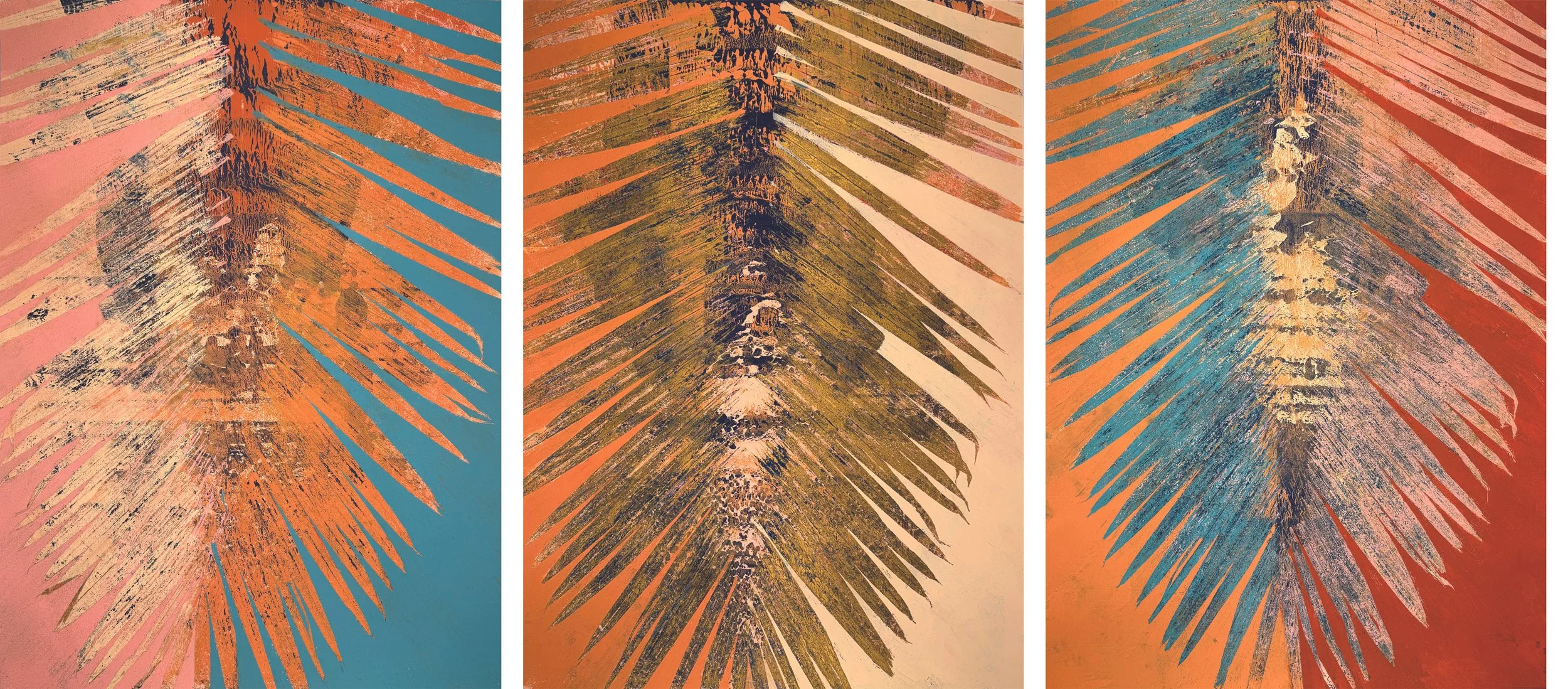
“Tropical Nostalgia”
Artist Diaries
12/24/25
Usually in my art I barely do any figurative imagery. The only one that keeps coming back in different forms are leaves. Some of these examples that I love are seagrape tree (uva playera) and the Aspen trees. But the one that I have always missed dearly since moving to the US has been the palm tree from Puerto Rico. Compared to the other ones, its form is the only linear repetitive one. Since I naturally select lines vs circles and I love weaving, it’s understanding that the palm tree is the most logical for me.
I always envisioned an ongoing project of palm interpretation. For this series, I wanted to play with color creating a mix of Andy Warhol pop art repetition mixed with graffiti feeling. Instead of a solid segmented contrasting color mix, I wanted to bring my texture pattern technique with the smallest details of color and layers to it. Since I have my background in textiles, and have studied many ways of pattern creations, it has been very fun to incorporate the layering techniques.
I created pieces in groups of colors. Each group has one frond assigned from an actual living palm tree. I always tried selecting the frond that was very old or deteriorating that needed to be trimmed. Each group can have from 3 to 5 art pieces (even though later on I realized 3 pcs is the perfect number for a group). Ideally, I would love for all of them to be individually framed in a consistent form, hanged side by side staggered around, and to reach a 20-30 of them but sold individually. Would be nice if this series was created every year and becoming a repetitive presentation. Their piece number will represent how old they are.
My first layer for all the groups started with a flat layer of light sand beige pinkish color. The second layer was a lineal navy color (which will eventually pop up between the shadow layers). The navy color excess actually became a separate project called Sounds Waves. After both layers dried, then it became a game of multiple color layer application with positive and negative space between the 3-5 art pieces. This last phase had 4-6 wet layers that had to be done in a fast pace to avoid the painting to dry and be able to transfer from one to the other. I love how you can still find very small pieces of the actual palm segments that dried in the paint. Since my comfort zone has always been black and white, this is my personal project of forcing color to create a relationship with me.
Most of the pieces are 18”x24”, which later I found that I would have preferred a bigger paper to have preserved the end of the segments. But there is always a positive side… I kept all these ends that were in the left-over paper and created another piece called Lucy. Also learned that I needed more materials to keep up the pace in each creation and be able to move around. The next round of samples will be 22”x30.
Towards the end, I manipulated some of the leaves. Sometimes they would stick together and form a solid wall of stencil and not allow the details between the segments to show. If it was too dense, I separated them and spread them out. On the opposite side, if I wanted to create a solid “flat” outer negative space, I would use the advantage of the solid wall to firmly create a separate space as background. The perfect combination would be to have a solid area and an opening every 3-5 segments. I also tried to emphasize the space in the center of the frond by using a silicon plastic “brush” and paint guidelines of where the center is, on at least one side of the frond.
In future an experiment could be to use a spatula and scrape off the paint from the segments with light pressure, which will make it have a gradation effect and restart again. If the segment is too weak, play with leaving more of the segment behind in the paper instead of “accidental” pieces. This could create a cool advantage or disadvantage depending on whatever comes out. But this exact unpredictable fact is what I love about it. How to play with uncertainty and lack of fully control while still making it beautiful. If I feel the scrape is too dry and not dense, add white paint or paint thinner to avoid the segment to break and see how it turns out. Enjoy the surprises, that is how the best unique pieces are created.